.png)
mobile phlebotomy
certification experts

timeline
JUL - SEP 2024

tools
Canva

team
1 Designer
objectives
-
Design a logo fitting the brand image
-
Create a business card showcasing the new logo and brand image
first steps
My first step in this process was to conduct a discovery call with the company’s owner to understand her key priorities and business goals. This conversation was essential in shaping the design direction for her logo. We explored color schemes, brand personality, visual elements, and typography to ensure the final design aligned with her vision and resonated with her target audience.
priorities
The owner had a particular vision for this project and its elements. Her priorities were evident.
1. Color Scheme: Cool, calming, eye-catching
2. Elements: Ambulance, badge, ribbons, needle
3. Fonts: Bold, professional
Tt
Tt
finding the final design
Throughout this process, I found that active collaboration with the client was essential to ensuring the final design met her expectations and aligned with her brand identity. Through iterative feedback and refinement, we explored multiple design options before selecting the one that best represents her brand and resonates with her audience.


the final design

beginning the business cards
Integrating the final logo into the business card design was essential to ensuring a cohesive and seamless brand experience. By maintaining consistency in color schemes, typography, and overall design language, the card reinforces brand identity while enhancing user engagement. The goal was to create a visually harmonious and intuitive design that resonates with the consumer, fostering a stronger connection and a more fluid, user-centered experience.
the final design
The business card design remained largely unchanged throughout the process, as the core design elements were already well-defined. The final iteration was crafted with a user-centric approach, ensuring it effectively met the client’s objectives while optimizing clarity and engagement for consumers. Every design decision was intentional, focusing on accessibility, brand consistency, and a seamless user experience.

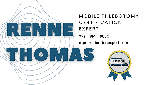
Front
Back
my takeaways
This experience was invaluable in deepening my understanding of brand personality and design cohesion. I gained insight into the importance of aligning visual elements to create a seamless and recognizable brand identity. Through collaboration with the client, I learned how to balance their needs with design best practices, making strategic compromises to ensure both functionality and aesthetic appeal. Additionally, I explored typography pairings, color harmonies, and the broader impact of brand perception on final design outcomes—all essential factors in crafting a meaningful and user-centered experience.